BicycleShop
UX Design Case Study
UI/UX Design for a responsive e-commerce website (Google UX Design Certificate)
BicycleShop
UX Design Case Study
UI/UX Design for a responsive e-commerce website (Google UX Design Certificate)
Overview
BicycleShop is a clean, user-friendly e-commerce site for cycling enthusiasts. I designed it to showcase bikes and accessories with detailed information, high-quality images, and customer reviews that help shoppers make confident decisions. The responsive design works beautifully on any device, whether you're browsing on your phone during a commute or comparing models on your desktop at home.
Role
- • UX Designer
Duration
1 Month (November 2023 - December 2023)
Tools
Problem Statement
Many cycling websites overwhelm shoppers with cluttered layouts, technical jargon, and confusing navigation. This creates frustration for people trying to find the right bike, especially on mobile devices where small text and poor organization make shopping nearly impossible. I set out to create a clean, intuitive e-commerce experience that makes it easy to find and compare bikes, read useful product information in plain language, and make purchases confidently from any device.
Approach
I approached the BicycleShop redesign by focusing on what actual cyclists need when shopping online. Through user interviews and competitive analysis, I identified key opportunities to improve the typical e-commerce experience. I created designs that prioritize clear product information, intuitive navigation, and beautiful product visualization. My process involved multiple rounds of testing and refinement, ensuring that the final design truly addressed user pain points while showcasing the products effectively.
Solution
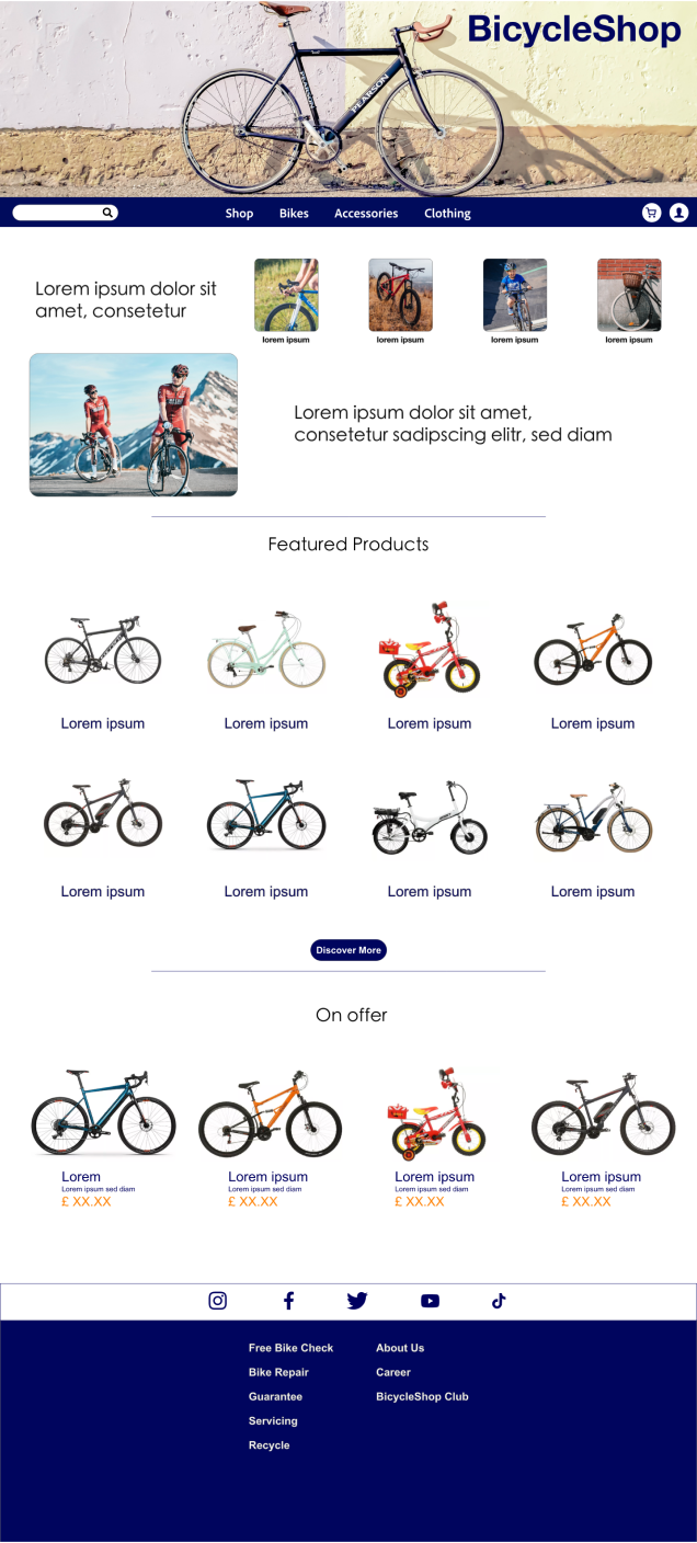
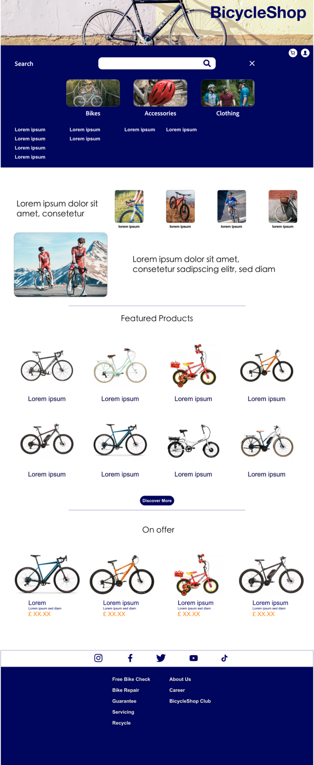
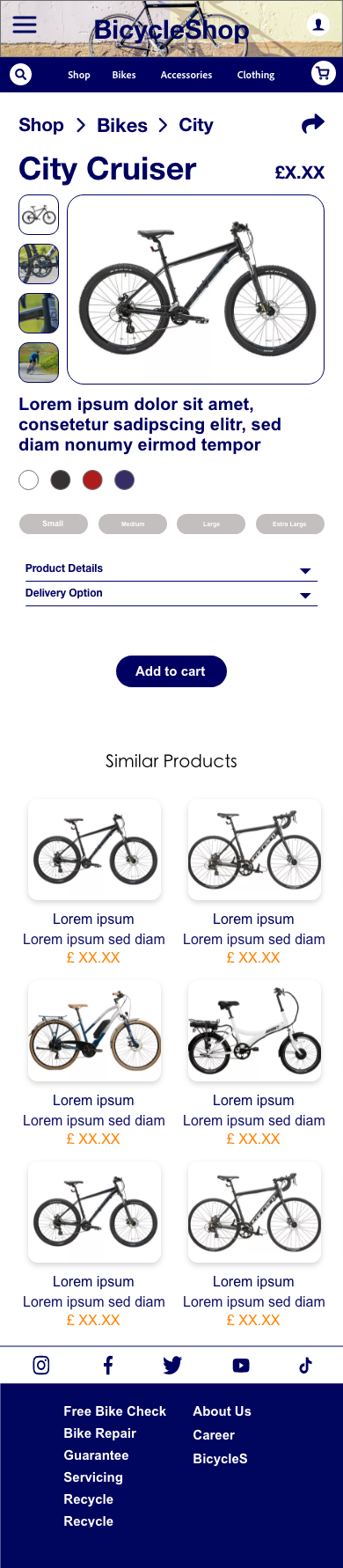
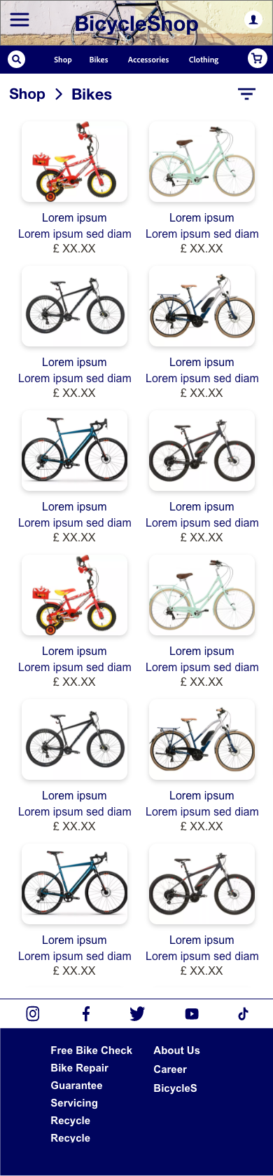
The BicycleShop website features a clean, modern design that makes finding the perfect bike simple. Product pages include high-quality images from multiple angles, straightforward descriptions that explain technical features in plain language, and genuine customer reviews to build confidence. The responsive layout adapts beautifully to any screen size, with thoughtfully designed navigation that works equally well on mobile and desktop. The checkout process is streamlined to just a few steps, with clear shipping information and secure payment options that give shoppers peace of mind.
User Research
I conducted research on how people shop for bikes online, analyzing their behavior patterns and identifying pain points with existing websites. I discovered that users want clear product comparisons, simple explanations of technical features, and trustworthy reviews. They get frustrated by information overload and complex checkout processes. These insights guided my redesign to create a more streamlined, helpful shopping experience focused on clarity and ease of use.
Pain Points
Pain Point 1
Technical specifications are often written in confusing jargon
Pain Point 2
Product images don't show enough detail or different angles
Pain Point 3
Mobile shopping experiences feel cramped and difficult to navigate
User
John, a software engineer who enjoys cycling on weekends, needs a straightforward website to find a quality bike and accessories without getting lost in overwhelming technical details.
Persona
User Journey
John's journey revealed how a thoughtfully designed website could transform the bike shopping experience. Clear navigation, helpful product information, and a streamlined checkout process would address his major pain points.
| Action | Task List | Feeling | Improvements |
|---|---|---|---|
| Search for a bike shop online | A. Open a search engine and type in "bike shop". B. Click on the search results and browse through the websites. | Hopeful, but a bit overwhelmed by the options. | Improve SEO and website design to make it easier for users to find relevant bike shops. |
| Check out the available bike options | A. Browse the different bike categories and options. B. Read the descriptions and specifications for each bike. | Confused by the technical jargon. | Simplify bike descriptions and provide clear explanations of technical terms. |
| Choose a bike and accessories | A. Add the chosen bike and accessories to the cart. B. Check for any special offers or discounts. | Excited about the new bike and accessories. | Provide special offers and discounts to encourage purchases. |
| Make the purchase | A. Enter personal and payment information. B. Confirm the order. | Anxious about the security of personal and payment information. | Provide a secure and trusted payment system. |
| Receive the bike and accessories | A. Wait for the delivery. B. Track the order. | Anxious about the delivery time and condition of the bike and accessories. | Provide a reliable and timely delivery system with package tracking. |
Design
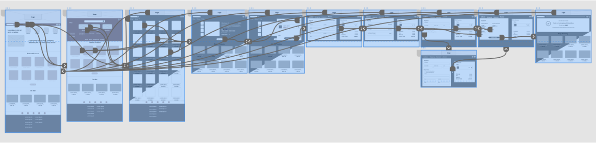
Paper Wireframes
Digital Wireframes
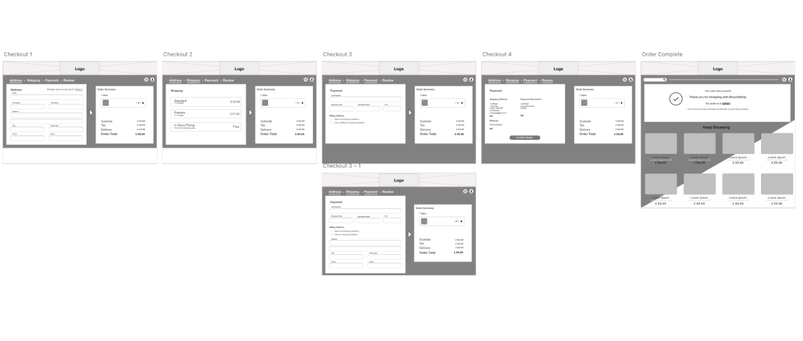
Low Fidelity Wireframes
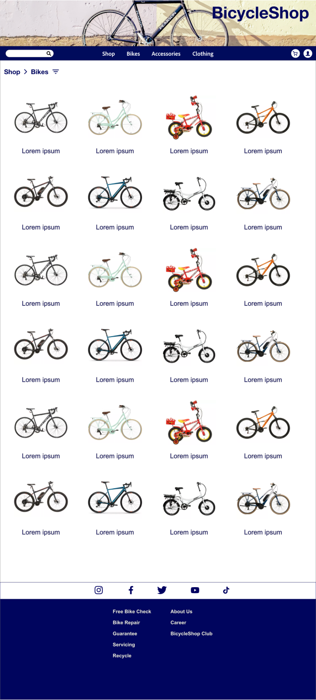
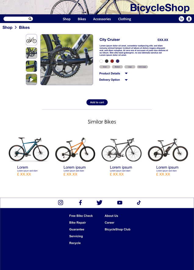
Mockups
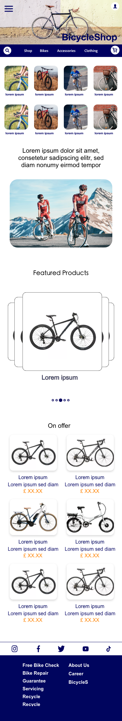
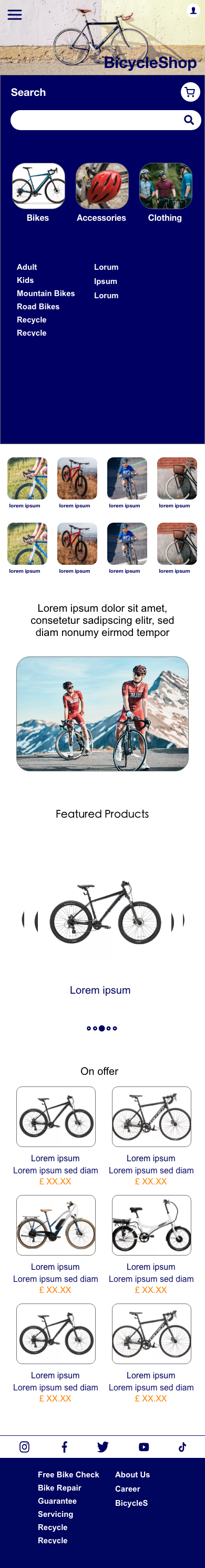
Mobile Mockups
Learnings & Reflections
Designing BicycleShop taught me how to create e-commerce experiences that balance business goals with user needs. I learned to present complex product information in accessible ways without overwhelming shoppers. This project strengthened my skills in responsive design and helped me understand how to create interfaces that work seamlessly across different devices. I also gained valuable experience in user testing for e-commerce, identifying the small details that can make or break the shopping experience.